Since my youthful video game exploits are oddly well documented here on Brand New, I'll add to the well with another bit of useless personal information. It being that the last console I owned was an original PlayStation, which I wore out with several seasons of NBA Live. Since then, of course, two far more advanced generations of PlayStation have come into existence, with PlayStation 3 being the most recent. This September, without delving into Generation Four territory, PlayStation officially unveiled the latest update featuring a slimmer hardware design along with other software improvements and a streamlined new logo.
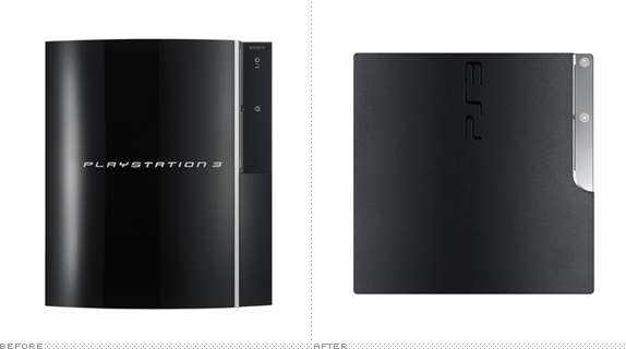
PS3 console before and after. Console images [source]: ©2009 Sony Computer Entertainment Inc. All rights reserved.
Concurrently with the release of the new PS3 system, SCE will modify the PS3 brand name from 'PLAYSTATION 3' to 'PlayStation 3', and introduce a new [PS3] logo, which is engraved on the surface of the new PS3 system. By unifying under the familiar 'PlayStation®' name, which represents the entire PlayStation family, PS3 together with PlayStation®2 and PSP® (PlayStation®Portable) will further expand the PlayStation business, and will continue to enhance the entertainment experience along with the ever-growing PlayStation®Network.
—Press Release
One of the most notorious, for better or for worse, traits of the previous PlayStation 3 logo was that it oddly looked just like the Spider-man movies, which, in turn was a derivative of Greg Samata's Mata and/or Rick Valicenti's Bronzo. Point being, for me, the PlayStation 3 never looked or felt like an original logo or something that could be singly tied to the console, always drawing comparisons to the $2 billion franchise. In exchange for the spidey font, PS3 is set in the same minimalist approach of the more visually successful PS2 (PlayStation 2) and PSP (PlayStation Portable) logos.
Family of PlayStation logos currently on the market.
But instead of a delicate mono-weight and geometric drawing, like the PS2 and PSP, we have what would be a Humanist lettering job, with different thicknesses that don't look quite pleasant. It's a fine logo to be honest, but there is something about it that is not quite fully well executed, with odd curves and horizontal lines that are just too long — you would need a full tank of gas to get through that 3. It's also close enough to the PS2 and PSP logos that I wonder if it shouldn't have just been the same. Although I'm sure we will be seeing less of the PS2 soon enough, leaving only the PSP and PS3 logos, with the latter as the older and more robust sibling. Regardless, it's nice to see the old lettering fade away.
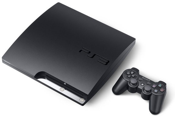
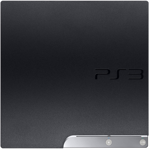
New PS3 Slim. Console images [source]: ©2009 Sony Computer Entertainment Inc. All rights reserved.
Thanks to Christopher M. Yates for first tip.
Nenhum comentário:
Postar um comentário